Features / Insights
Insights.
The Insights area shows where your time, money, and materials are going across three screens: Analytics, Reports, and Material trends.
Analytics
#/analytics
The Analytics overview shows a year-to-date expense breakdown, a rolling eight-week hours chart, and a week-by-week financial summary.
Reading the expense breakdown
- Navigate to Analytics. The screen loads with two side-by-side cards and a table below.
- The Expense breakdown YTD card shows a donut chart of your year-to-date spending by category.
- The center of the donut displays your total YTD spend. Each colored segment and its legend row show a category name and dollar amount.
- Up to six categories appear individually. Any remaining categories are grouped into a single Other segment.
Reading the weekly hours chart
- The Week-by-week hours card shows a bar chart covering the last eight calendar weeks.
- Each bar is labeled with the week's start date. The value at the top of each bar shows total hours logged that week.
Reading the weekly summary table
- Scroll below the two cards to reach the Weekly summary table.
- Each row represents one week. The columns are:
- Week of - week start date
- Status - Open (not yet submitted) or Submitted
- Hours - total hours logged
- Billable $ - billed amount for the week; shows a dash when not reported by the server
- Spend - expenses logged during that week
- Net - Billable minus Spend; shown in green when positive, red when negative, and a dash when billable data is unavailable
- The table loads with the most recent week at the top.
Rate Analyzer
The Rate Analyzer opens with three summary figures at the top:
- Blended effective rate - your average revenue per billable hour
- Cost per hour - what each hour actually costs across all expense categories
- Margin per hour - the difference, with a percentage of effective rate
Below those, two cards appear:
- Where each hour goes - a donut chart breaking your total cost per hour into labeled cost categories.
- Per-job effective rate - a table showing billed amount divided by hours logged for each job.
The The honest read section at the bottom restates your rate, cost, and margin per billable hour in plain language. An inline tip links to the Rates screen (#/rates) if you need to adjust a per-client rate. For the full walkthrough, see Rate Analyzer under Estimating.
Reports
#/reports
The Reports screen organizes financial output across three tabs: Profit by job, Cash-flow forecast, and Tax estimate. All three tabs draw from the same data loaded when the screen opens.
Switching tabs
- Navigate to Reports.
- Click any of the three tab buttons at the top of the screen to switch. The active tab is highlighted.
Profit by job
- Click the Profit by job tab.
- Three KPI tiles appear at the top:
- Revenue, all jobs - total invoiced across all jobs with any activity
- Direct cost - total material expenses filed directly to jobs
- Margin - revenue minus direct cost; shown in red when negative
- A table below lists one row per job that has any revenue or cost on record. Columns are Job, Revenue, Cost, Margin, and Margin %.
- The table is sorted thinnest margin percentage first, so the least profitable jobs appear at the top. Jobs with cost but no revenue appear last.
- Each job row includes a small bar graphic under the job name comparing revenue width to cost width at a glance.
- The Margin % column shows a color-coded pill: red for negative, amber for under 25%, green for 25% and above.
- Click any row to open that job's detail page.
- The footer row totals revenue, cost, margin, and overall margin percentage across all listed jobs.
Cash-flow forecast
The Cash-flow forecast projects future cash position using your year-to-date revenue and expense run rates plus recurring obligations. The tab includes these controls:
- A granularity toggle between weekly and monthly projections (default: monthly)
- A horizon setting controlling how many periods to project (default: 8 weeks or 6 months)
- A tax rate input used in the projection (default: 22%)
Material trends
#/materials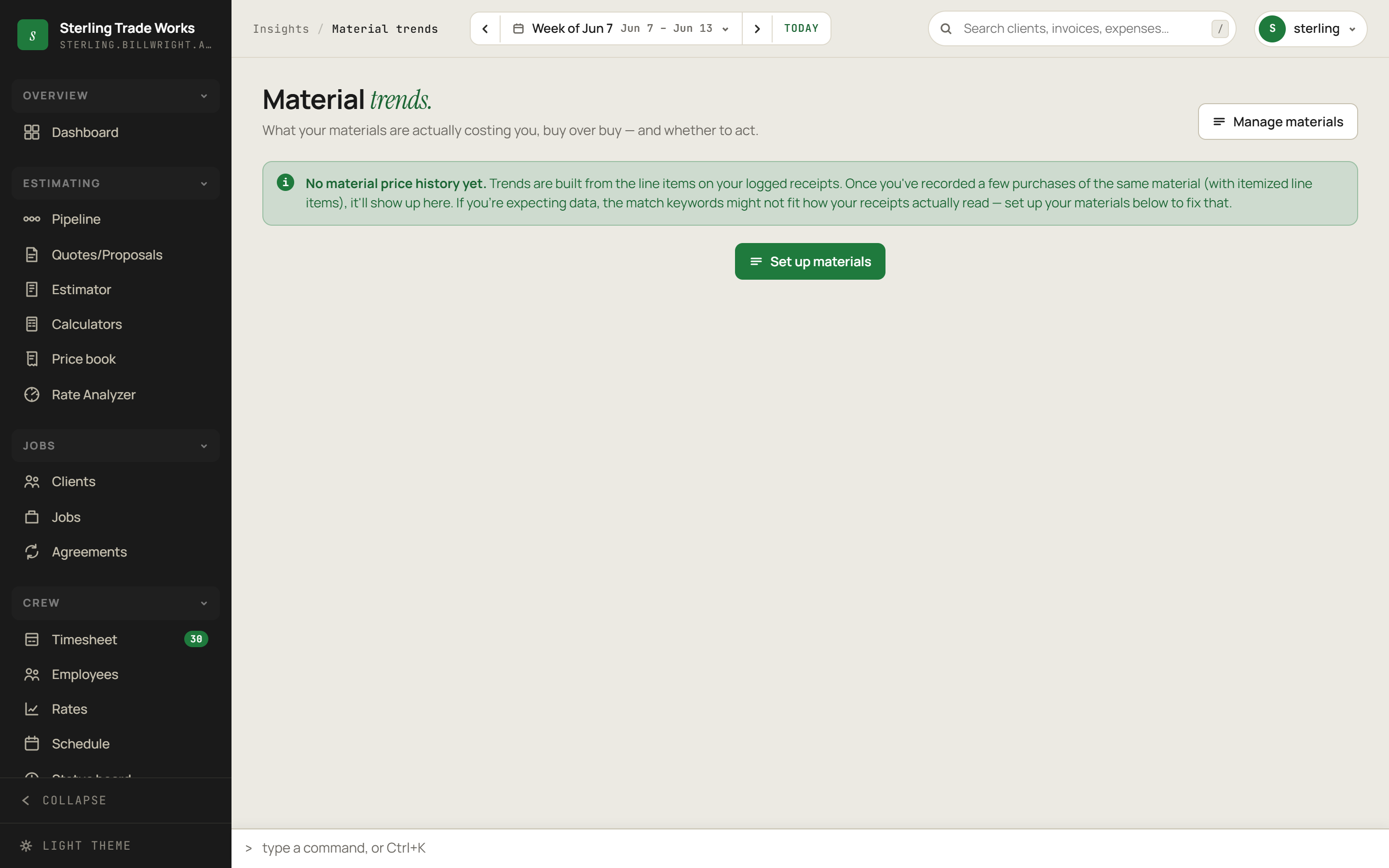
The Material trends screen tracks price movement for the materials you buy, derived entirely from your own logged receipts - not from an external market feed. The screen is explicit that its leans are decision support, not price forecasts.
First-time setup
If no itemized receipt data exists yet, the screen shows an info message and a setup button.
- Navigate to Material trends.
- Read the info message. It explains that trends are built from itemized line items on logged receipts once you have recorded multiple purchases of the same material.
- Click Set up materials to open the materials catalog modal.
- In the modal, define the materials you want to track and set the match keywords that link receipt line items to each material.
Reading the overview
When price history exists, three KPI tiles appear:
- Materials tracked - count of materials with at least one logged buy
- Flagged "buy sooner" - how many materials carry a buy-sooner lean; tile turns amber when this is non-zero; the delta line shows how many are trending up overall
- Most recent buy - date of the most recent purchase across all tracked materials, plus the vendor count
An info banner below the KPIs restates that the data comes from your own purchases and cannot see mill prices or market futures.
Reading a material card
Each tracked material appears as a card in the grid. Each card contains:
- Name and spec in the card header.
- A star button in the upper right to watch or unwatch the material.
- Latest unit price and a 90-day change indicator: an up arrow in amber for rising prices, a down arrow in green for falling prices, or a dash for flat.
- A lean pill summarizing the recommendation:
- Buy sooner - price trend suggests acting before further increases
- Unclear - not enough signal to lean either way
- No rush - price trend is flat or easing
- A price history chart plotting unit price across all your recorded buys for that material. If fewer than two buys exist, a "Not enough buys to chart yet" placeholder appears instead.
- A reason line explaining the lean in plain text.
- A confidence bar showing signal strength as a percentage, and a buy count plus vendor list in the card footer.
Watching and unwatching materials
- Click the star icon on any material card.
- A toast notification confirms: "Watching - pinned to top." The star fills in and the card gains a highlighted border.
- The screen reloads and the watched material moves to the top of the grid.
- To unwatch, click the filled star. A "Removed from watch" toast confirms, and the card returns to its default position on the next load.
Managing the materials catalog
- Click the Manage materials button in the screen header (upper right area) at any time.
- The catalog modal opens, where you can add, edit, or remove materials and adjust match keywords.
Default card order
Cards are ordered as follows:
- Watched (starred) materials at the very top
- Among unwatched: Buy sooner first, then Unclear, then No rush
- Within each lean group: largest 90-day price change percentage first
Watching a material overrides all other sort criteria.